Free Website Audit: Discover what's holding your digital presence back
E-commerce Website & Brand
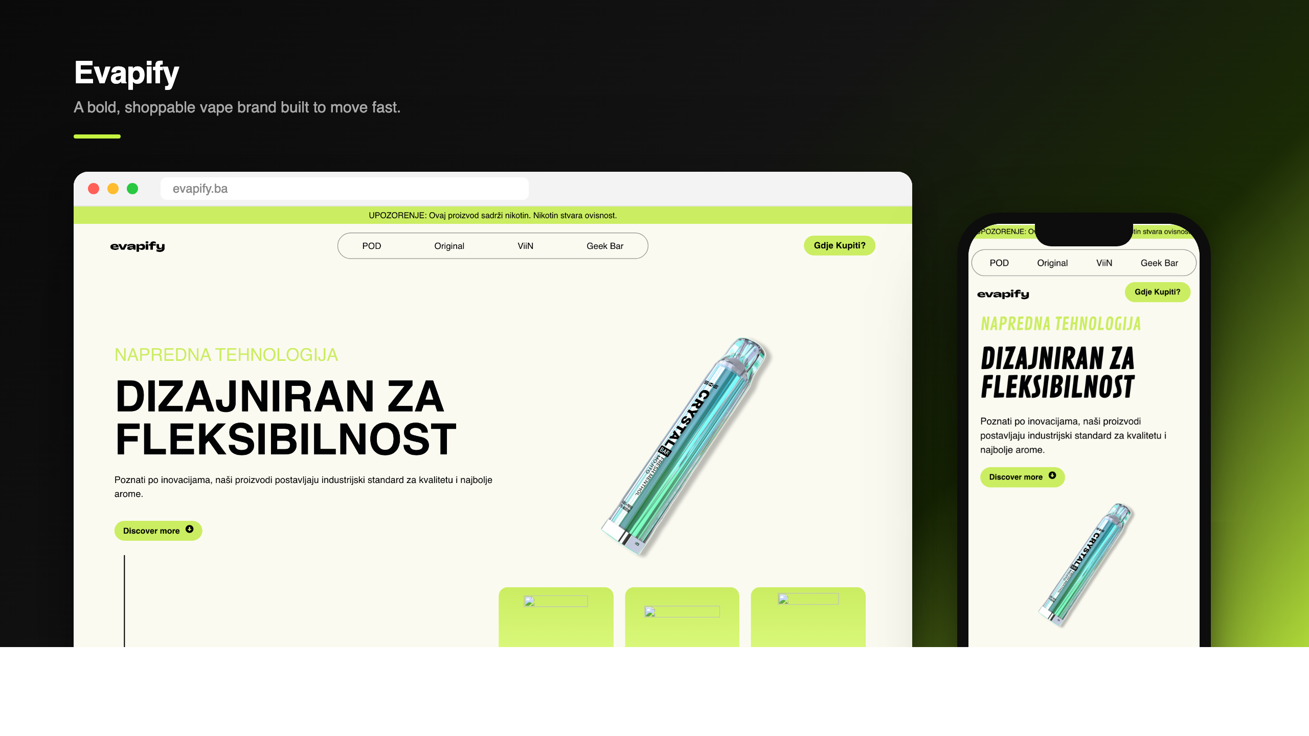
Evapify
We designed and built Evapify a product-led brand and e-commerce storefront, turning a fast-moving range of disposables, pods and pouches into one bold, acid-green world that converts browsers into buyers.
Evapify needed a single home loud enough to carry an entire product universe, ViiN disposables, Crystal Pro and Crystal Original vapes, Crystal Pouches and Geek Bar Pulse, without feeling like a catalog. We delivered an end-to-end brand and e-commerce build: a high-contrast lime-and-black identity, a motion-driven hero that pins and reveals the device, flavour-coded product grids with battery and strength indicators, and a storefront architecture that lets new lines drop in without a redesign. The result is a fast, scroll-driven experience that reads as one confident brand from first frame to checkout.
The Challenge
Evapify was launching into a crowded Bosnian market with a deep, fast-moving range, ViiN disposables, Crystal Pro and Crystal Original devices, Crystal Pouches and Geek Bar Pulse, and no single place that made it feel like one brand. Every line had its own packaging logic, its own flavours, its own strength and battery specs.
The tension was speed versus coherence. New products land constantly, so a static, hand-built catalog would have aged in weeks, but a generic shop template would have buried the energy that makes the brand worth buying. They needed something loud and modern that could also absorb a moving range without breaking.
The brief: build a product-brand site and e-commerce storefront that reads as one confident world, bold enough to stop the scroll, structured enough to grow, and clear enough that a shopper can find a flavour, check its strength, and know where to buy in seconds.
Client
Evapify
Industry
Vape & Lifestyle Retail
Services
Brand Direction
E-commerce Design
Web Development
Motion & Interaction Design
Conversion Optimization
Team
Adnan Muratović: Design & Development Lead
Konzept: Engineering & QA
Konzept: Motion & Brand
Timeline
5-week build
Outcome
One bold brand world that turns a fast-moving product range into a shoppable, scroll-driven storefront.
The Approach
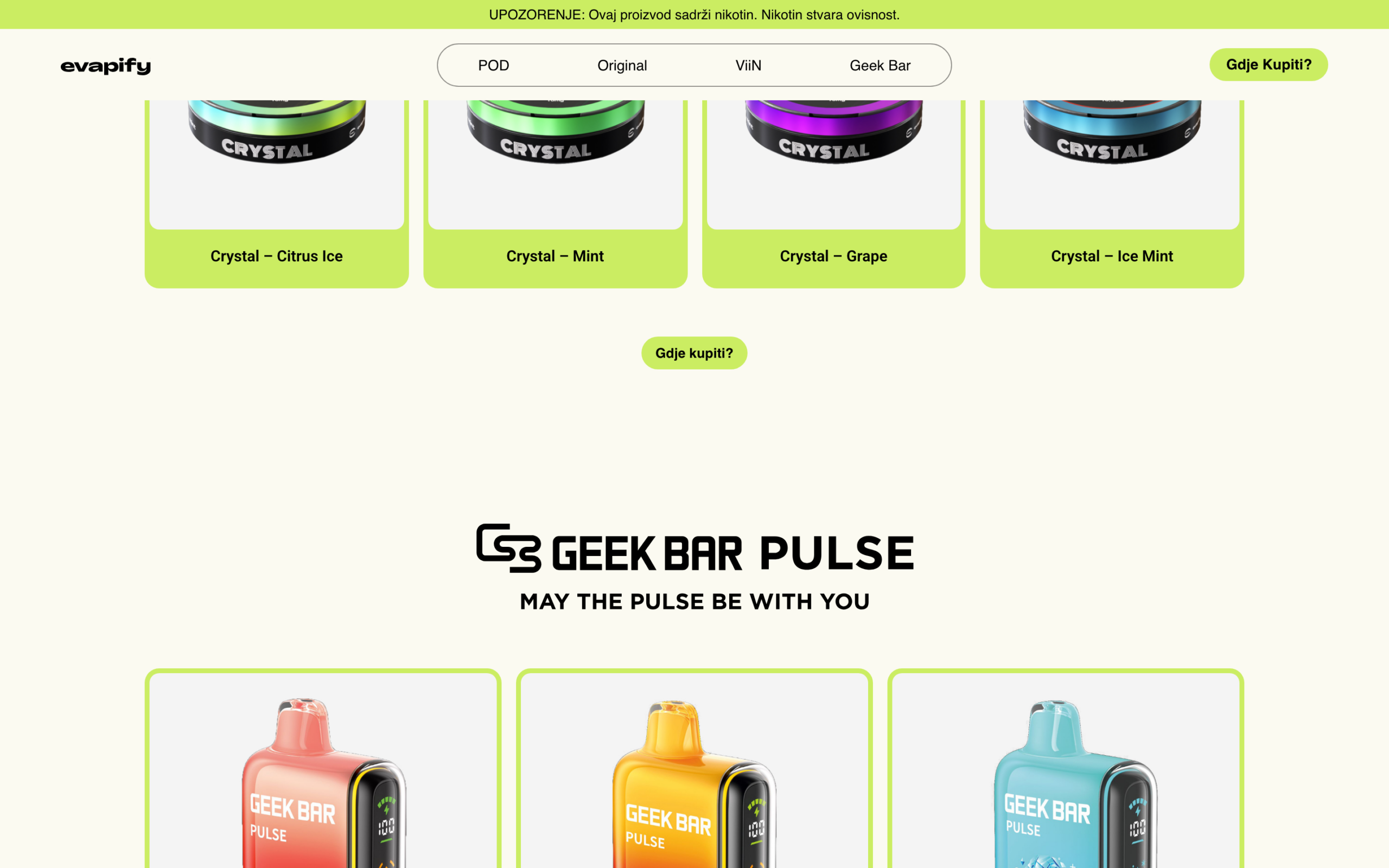
We treated Evapify as a brand first and a shop second. The whole experience runs on a single high-contrast system, acid lime against deep black, oversized condensed type, and a flavour-coded colour language that turns specs into signal. From the pinned, motion-led hero down to the last product grid, every line of the range inherits the same rules, so a customer scrolling from ViiN to Crystal Pouches to Geek Bar Pulse never feels like they have left the brand.
Brand & Storefront System
<p>We built one identity and one storefront framework to carry the entire catalog. The lime-and-black palette, condensed display type and rounded product cards become a repeatable system: each line, ViiN, Crystal POD and PLUS, Crystal Original, Crystal Pouches, Geek Bar Pulse, gets its own lockup and colour accents while sharing the same grid, the same card anatomy, and the same shop-now logic. New products drop in as content, not as redesigns, so the brand can move as fast as the range does.</p>
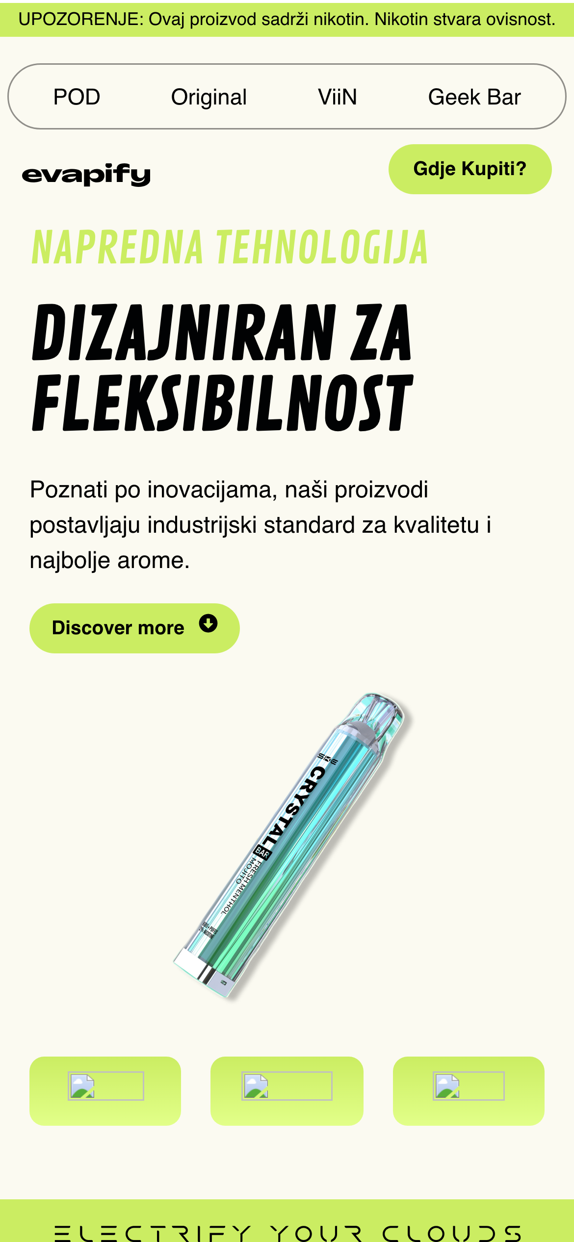
Motion-Led Hero
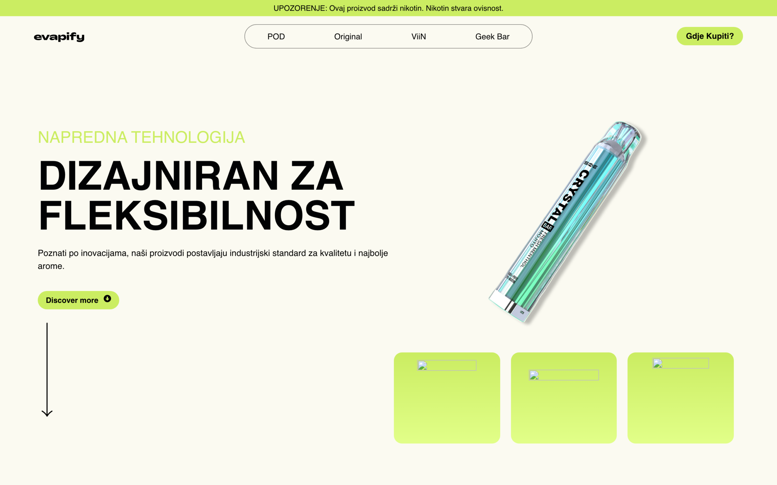
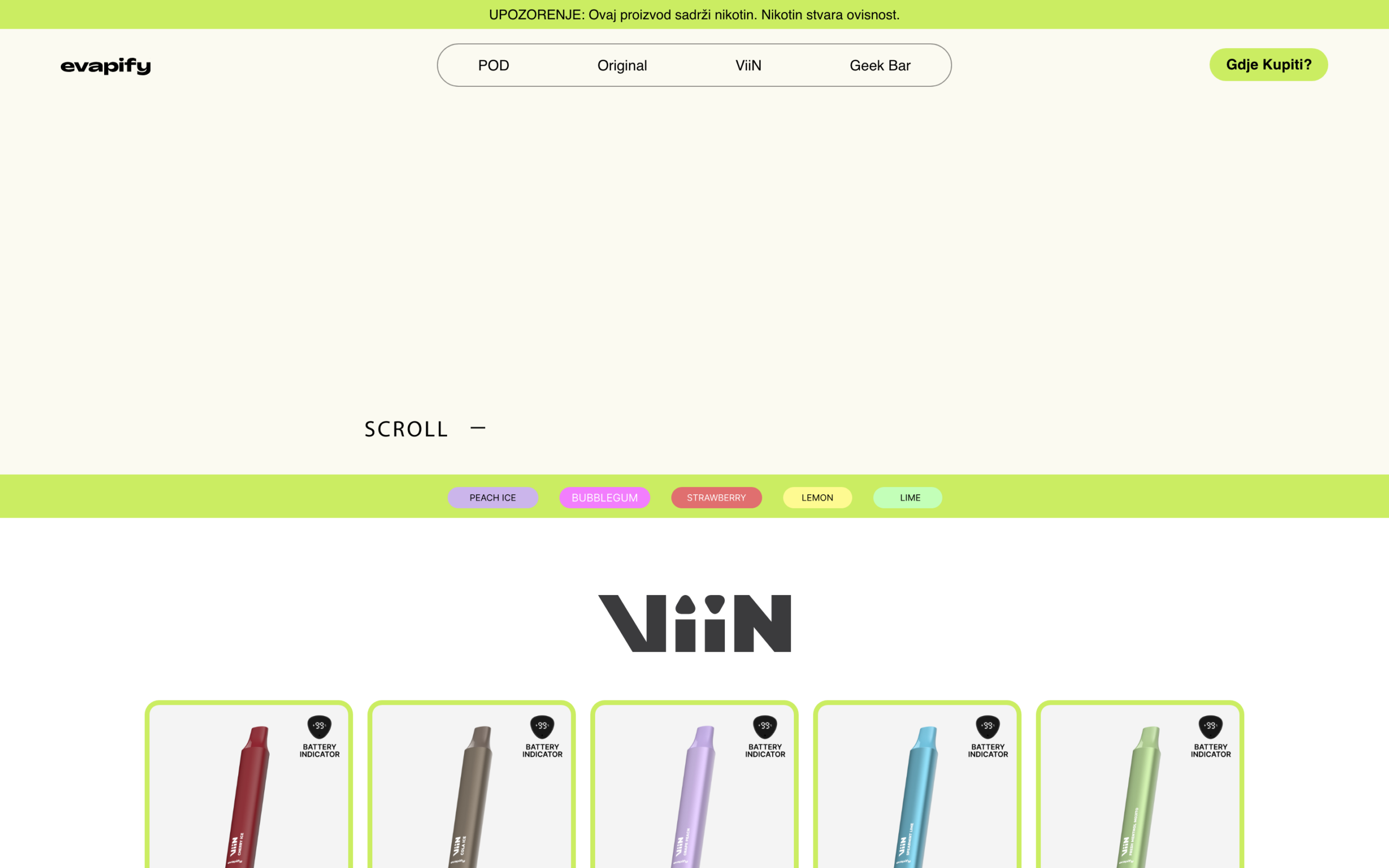
<p>The homepage opens with a pinned, scroll-driven hero, 'Dizajniran za fleksibilnost', where the device render holds the frame and the flavour chips (Peach Ice, Bubblegum, Strawberry, Lemon, Lime) animate in as the page advances. It is the brand's whole personality in the first scroll: confident, product-forward and unmistakably Evapify, setting the tone before a single price is shown.</p>
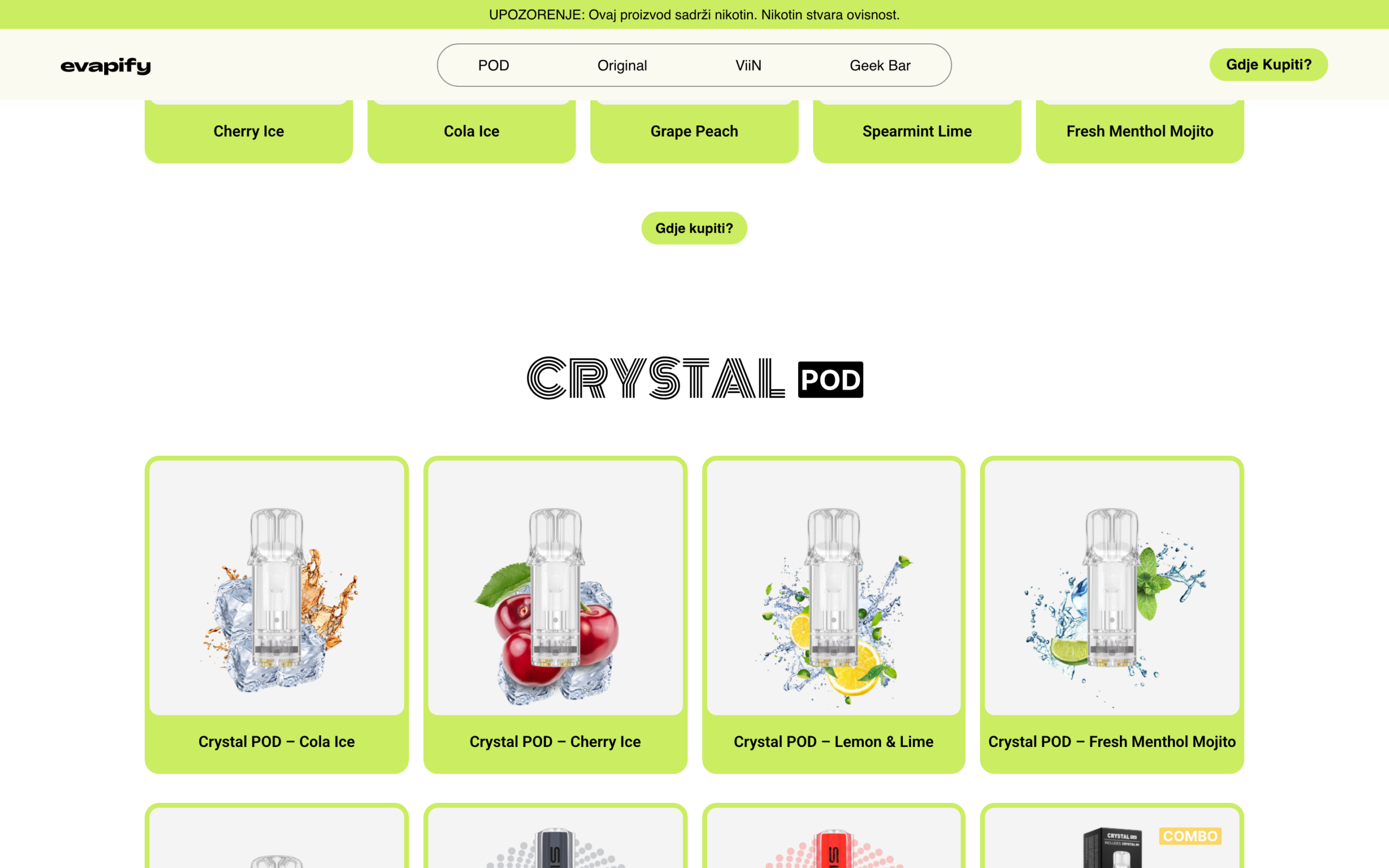
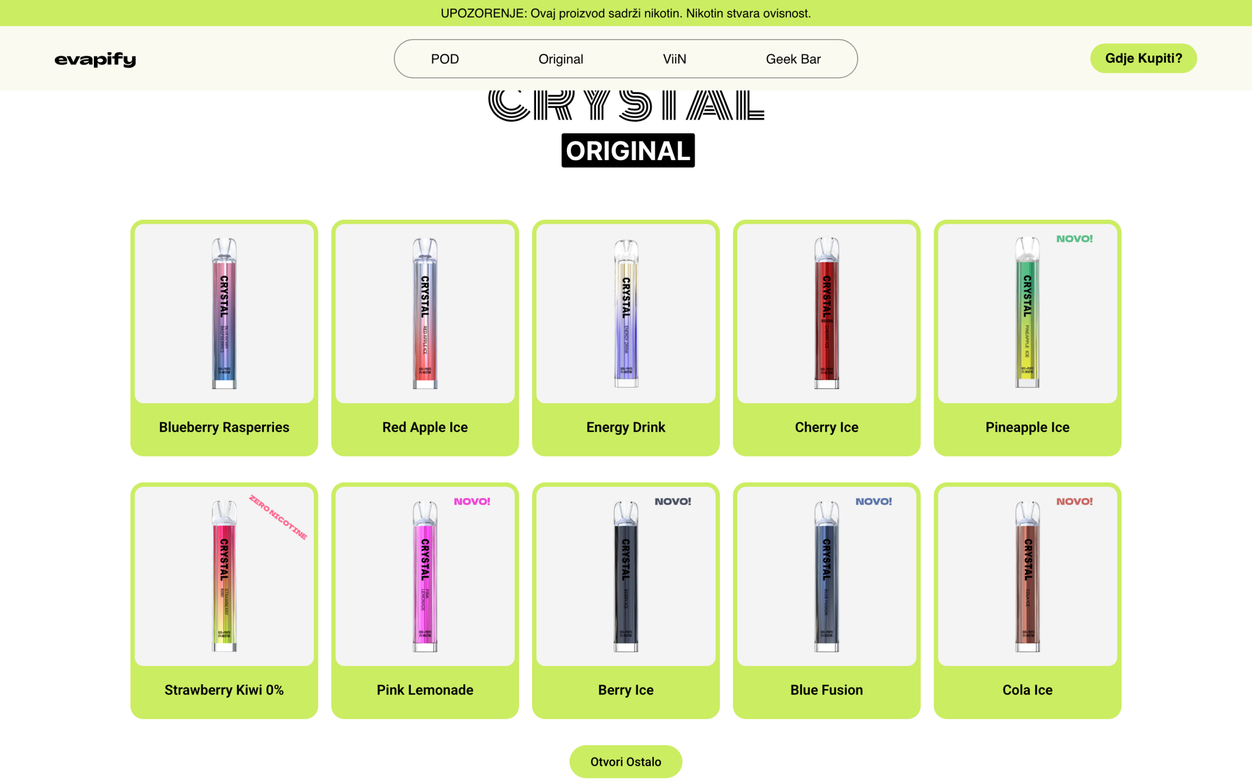
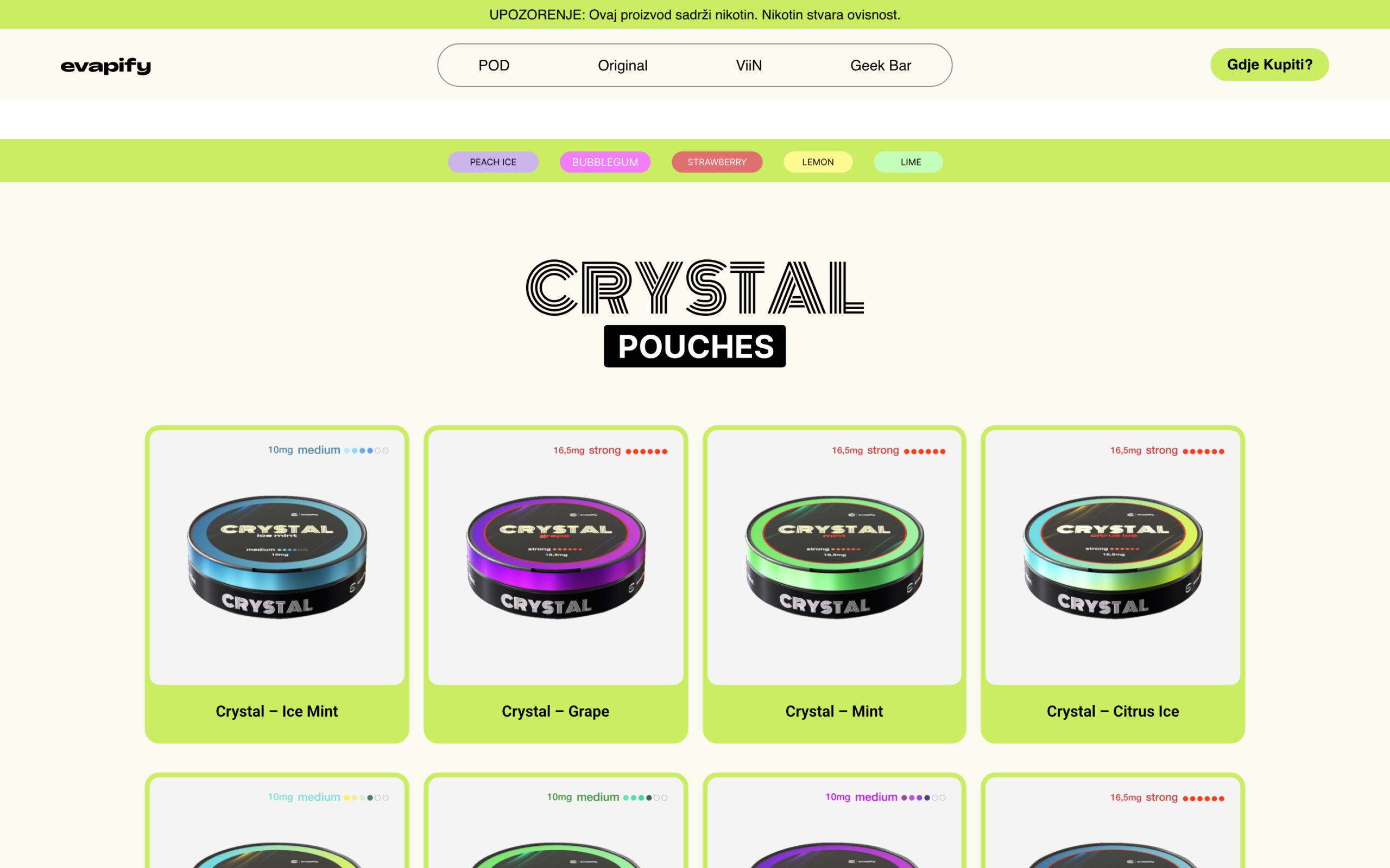
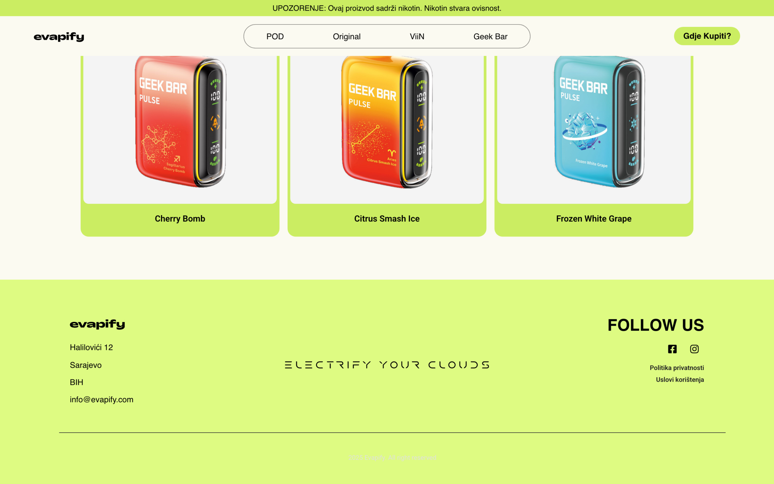
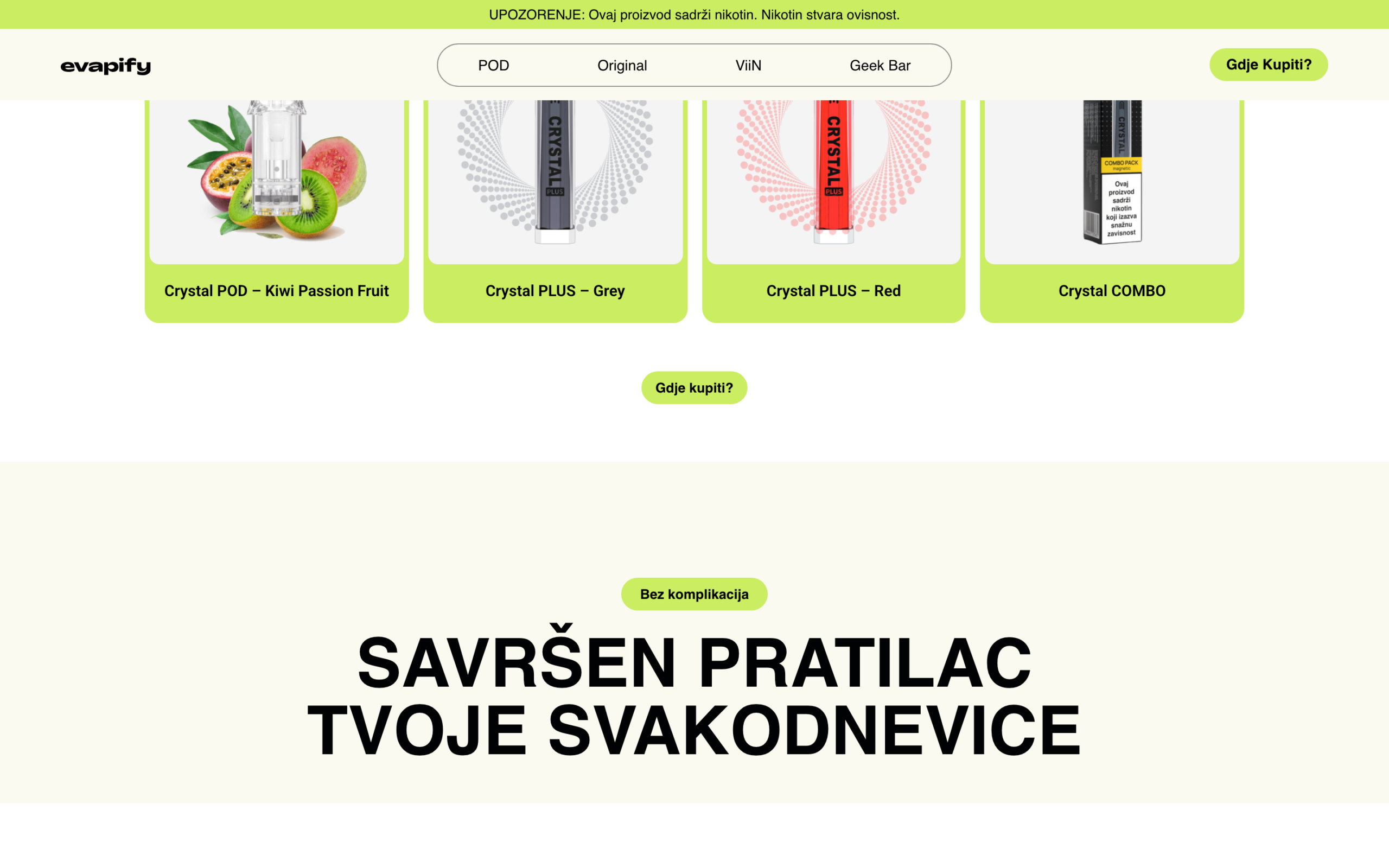
Shoppable Product Grids
<p>Every line lives in a flavour-coded grid with battery and nicotine-strength indicators built into the card, plus a clear 'Gdje kupiti?' path to purchase. Specs become scannable at a glance, so choosing is fast and confident across the full range.</p>

Konzept took a range that was honestly all over the place and made it feel like one brand. The site is loud in exactly the right way, people stop, scroll, and actually find what they want. And every time we launch a new flavour, it just slots in. That was the part that sold us.
Emina Hadžić
Brand Manager, Evapify
One Brand World
<p>Five distinct product lines now read as one coherent brand. The shared card anatomy, flavour-coded colour language and consistent shop-now logic mean every page, from the ViiN line-up to Geek Bar Pulse, feels deliberately part of Evapify rather than a stitched-together catalog.</p>
Built to Scale
<p>The storefront framework treats every product as content. New flavours, strengths and entire lines drop into the existing grids without touching the design system, so the brand keeps pace with a fast-moving range instead of falling behind it.</p>
Faster to Buy
<p>Specs, strength and flavour are scannable on every card, with a direct path to purchase. Shoppers go from browsing to a buying decision in seconds.</p>